Netherrealm (WBGames)
Making info-dense menus easier to scan.
Jan 2017–2019 (~2 years, ongoing) ∙ 12 min read
The Problem
Although Mortal Kombat X (what it was called before the refresh) had many active fans and users, and was a popular franchise with loyal fans, the game itself was described as old and outdated in many ways. The game was designed beautifully by a team of User Interface Designers, but the User Experience had never been thought about and reviewed as a priority. Therefore the UX was unintuitive and the experience of a new user was very confusing. You would have no way of knowing where to start, where to go, and what you can do at your Player Level. On a new install of the game, the main menu showed all game modes in a random order with poor learnability and comprehension. For example: why are there so many game modes and what makes them different from each other?
Additionally, the User Experience is the same whether you are a new player (with the exception of a intro scene), an intermediate player, or an advanced player that has been playing regularly and perhaps is looking for new content and something more challenging to match their skill.
MKX had some obvious problems on first glance:
Poor use of real estate: giant character image on left side takes up ⅓ of screen space and has very little importance
Important tiles should not be hidden 5 or 6 tiles down the list of vertical scrolling. No visual hierarchy and overwhelming number of choices. Regardless of what info was displayed, such as a new marketing ad, the core part of the game, and timed special events… they all are displayed in one long scrolling roll in no particular order of importance.
The first screen on load (Main Menu) is the same whether you are a New Player or an Advanced player. This makes the game hard to learn for new players, and confusing to navigate. The order had no rhyme or reason, and was not ordered by importance or relevancy to the Player’s progress. But this is common in every mobile app, especially because we know the mobile user is more likely to be on the go, and has less of an attention span than players sitting in front of a TV with dedicated time to focus on the game.
*Pictured left: game modes were ordered in 1 row, with only 2 out of about 10-12 options hidden at all times.
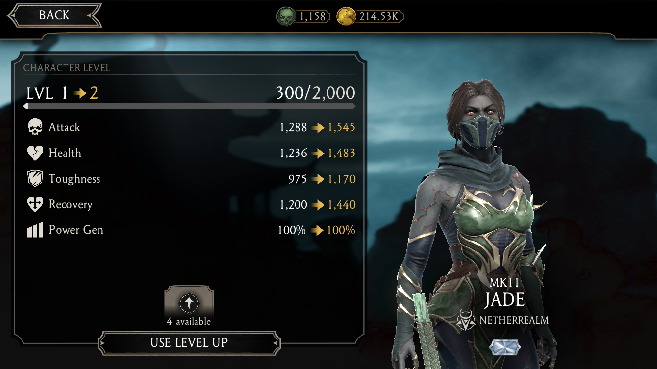
Worst of all, why are we showing Game Modes that New Users cannot possibly understand or play due to their characters’ lack of power? Contextual tutorials and game modes based on how far you are in the game, and what we would recommend you to play to advance (or just the perfect amount of challenge for each player to have fun!) is a must. New Players want you to tell them where to start, how they can level up and unlock more Characters, and probably immerse themselves with a bit of story and background as to who these characters are and what a “Netherrealm” is. Games are Entertainment, after all.Long paragraphs and unorganized info all mushed together without any visual hierarchy, but somehow still confusing to read. The average Character details had a very lengthy paragraph description that had no limit to the word count (many of these menus went up to 3 or even 5 paragraphs long).
No one has time to read all that! Almost every UX Designer will agree that “most people don’t read (They scan),” so avoid writing long essays. Instead, allow the user to quickly find the information they need so they can get to the part they’re here for: playing the actual game.Too many Currencies and Game Modes: Too many Currencies and Game Modes. On avg. 1/10 players, both New and Advanced, did not know what the currencies were, what to do with them, and where to get more. This dilutes the game’s economy (source: How to Build a Smart Game Economy).
My Role
-
UX Audit & Heuristics Evaluation to assess and identify weaknesses in all User Journeys and player experiences
Collaborative pitch and effort to systemize and unify brand and UX patterns with Sr. UI Designer (writing, branding, create reusable components system)
Improve onboarding experience of players with new downloads (pitched and lead effort)
Assess and Identify needs for improvement of readability and comprehension
Collab with Game Designers (for new game modes and cohesion)
Support PMs in creating a system for the Store, Promotional, and all in-game marketing needs
-
UX & UI Team:
1 UX/UI Lead
1 UX Designer
1 UI Designer
1-2 Producer(s)
Other Key Players:
1-3 Game Designers
1-2 Product Managers
2-5 Engineers (front and back-end)
QA (Quality Assurance)
Actions
First, I did some informal research to start by…
Familiarizing with the game as a player
Understanding player concerns through online forums to gain a sense of what users want from the game and how they like it, along with other hints to their frustrations, wants, comprehension, and general feedback. Although it is an informal form of research, the feedback is qualitative information directly from the source of the players, which is very valuable.
Conducting internal interviews with Game Designers and the learnings of the original team that designed the game that launched in 2016.
Part 1: optimizing the Main Menu
In early 2021, MKM received a major update including more content, gameplay, and improved UX. After shadowing the Mobile team for a month, I interviewed all the game developers to identify the challenges each discipline may want to address in the coming update. I drafted an audit of suggestions and presented them with my Lead for approval. Finally, I iterated Wireframes while working closely with Game Designers for feedback and their knowledge / expertise after getting the green light.
Iteration
Various reorganization of the Architecture and layouts of the visual hierarchy, and even ergonomics were considered and drafted through iterations of Wireframes before User Testing began.
A system and guideline was set up for all future content, including word count, and sentence structures. Additionally, all Ads and Updates are nested in a rotating carousel. The animation draws the users eye and attention to the Ads.


Part 2: Understanding our Users
Our User have certain behaviors and motivations that can be categorized as follows:
All users
Morning commute (~30 min)
Do Daily Objectives (few min) throughout the day
Focused play (few hours) on commute home or at home
New Players
MK fans new to the mobile game
New to MK franchise AND the mobile game
Advanced Players
wants new content
wants cool easter eggs just for them
wants challenging content
doesn’t want to have to relearn anything
UX Research: Usability Testing
You are not the user. So to understand and check your assumptions, and whether your design was good (a.k.a. you accurately rendered your intent), we have to do some testing on people that fit the profiles of our players described above.
Goals
I asked the UX Research team to test the following:
Speed — speed of scanability. One thing UX Designers know for sure is majority of the time, Users don’t read — they scan the page for what they’re looking for (Source: “Don’t Make Me Think” by Steve Krug).
Comprehension: Can player confidently find the specific stat / info about the character in an appropriate amount of time?
Intuitiveness — Does the organization of the info make sense to them, is it where they would expect everything to live?
Contextual info — Information and menus are not shown contextually, which overwhelms the user.
Findings
On average, it took most users more than 3-5 seconds to find what they were looking for when asked
Players were able to find specific stats and info 8/10 times, but they often expected to find specific info in a different place from where it actually lives. Most participants did not find what they were looking for on their first try / guess. The probability worsened if participant was not an Advanced User. Advanced Users sometimes knew what to do based on their own experience and memory. Most participants said they did not find the layout to be intuitive.
All participants found the huge wall of texts to be overwhelming. 2/10 participants willingly read the paragraphs about the character’s details. Even then, they were often unable to find answers to their questions about the character.
0/10 confidently understood all the currencies in the game, what all the currencies were named, where to earn / buy more, and what they could spend it on (this lead me to pitch a new feature: the Wallet system)
Big Picture Thinking
🤔
Big Picture Thinking 🤔
The Challenge: Improve the experience for New Players without alienating existing fans
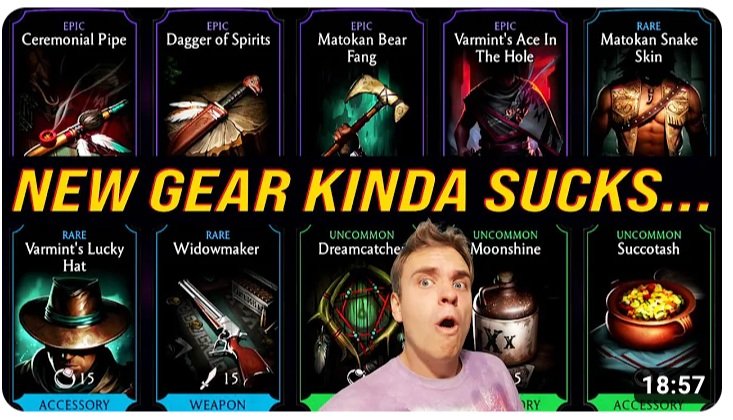
Pictured: MKM fan posts a Youtube review of their disappointment with a past update.
My Personal Goal:
Netherrealm designed MKM for existing fans and experienced players. These players became fans in the ‘90s and ‘20s when MK was born. But for new players, or people who want to play fighting games but aren’t familiar with Mortal Kombat as a brand (most of gen-z) I saw an opportunity to include and bring more players into the game and the franchise’s fanbase. My personal goal was to create a User Journey and improved experience for new players without alienating the existing MKM fans. The challenge was finding a balance of the two. Every update that asks Advanced Players to relearn parts of the game risks alienating them if any significant inconveniences are not worth the payoff. Updates and improvements must be seen as justifiable to these existing players and “whales” (biggest spenders) so we do not lose them while trying to gain more new players.
Read the full Audit and Proposal:
Setbacks and hurdles
〰️
Setbacks and hurdles 〰️
This was the only time I’ve ever experienced on a team where all the other disciplines unanimously agreed and saw value in the proposed designs 🤯
However, a few features that were lower on the priority list or more ambitious were scheduled for a later update (2.3). It was a compromise that was very reasonable and the trust that the Producers and the rest of the team put in me to make the game the best it could be was very appreciated.
Part 3: Character Details menu
THE METRICS
Metric Goals:
Minimize Day 1-7 user drop-off (increase conversion rate on daily new installs)
Reducing the learning curve = higher rate of adoption from new users
Increased average play-time per user, per day
Results & Public Feedback
The improvements made in update 2.0 had a positive impact on the game's user experience. Players found the streamlined menu system easier to navigate and the improved tutorial helped them understand the game's mechanics better. The rebalancing of the game made it more accessible, and the new features added to the game made it more engaging. As a result, the game's user base grew, and player retention improved.
Achievements
🏆 The Game Expansion and UX Upgrades were featured in the iPhone App Store as one of the best new updates in mobile games.
🏆 Our updates to Mortal Kombat Mobile was highly rated in the App Store and continues to be rated above a 4.5/5 stars to present.
Outcomes
Downloaded more than 50 million times as of August 2021
User Retention during the first week of download increased by ~30%. In-app purchases generated $200 million in revenue since it’s release. After the 2.0 update, the game had increased its average spend per user, as well as the total daily revenue.
Conclusion
Mortal Kombat Mobile's update 2.0 focused on improving the user experience for players. By streamlining the menu system, improving the tutorial, rebalancing the game, and adding new features, the development team was able to address some of the challenges that the game had been facing. These improvements had a positive impact on player engagement, retention, and overall satisfaction with the game.


